The Colour Of Your Interior And How It Makes You Feel
It is said that certain colours can impact upon a person’s mood or feeling, so one needs to think carefully before deciding on what colours to use as part of an interior design project or home makeover. It should also be noted that some rooms might be better suited to different colours. For example, yellow for a fresh-looking kitchen and blue for a bedroom. The choice is ultimately up to you, but it pays to bear in mind that just because you like a colour, it doesn’t mean it’s a suitable colour for home décor.
If you do have an interior design project in mind but are in need of inspiration, there are people you can ask. Trustworthy Gold Coast master painters, as well being masters of their trade, are also well placed to offer advice on any aspect of your planned painting project. Most well established painting companies offer customers much more than a simple paint job. They can provide advice on the most suitable colours for each room. Whether you take their advice is up to you, but due to their experience, they usually know which colours work and which don’t.
Your Guide to Colours and the Feelings they Evoke
Please see below for a list of colours and a short description of the moods or feelings they are said to evoke. As colour perception is a very personal thing, the descriptions may not be 100% accurate for you personally. However, this can serve as a general guide that will resonate with most people.
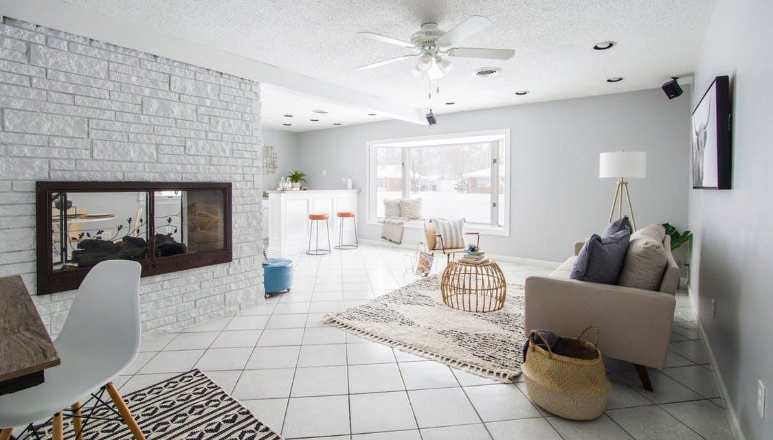
- Green – The colour green is forever associated with the natural world and, for many people, installs a sense of calm. Green can also be correlated with health and could perhaps act as a stimulant when used in a bedroom setting. Another room in the house that can be correlated with the colour green is the kitchen. The fresh natural look it projects make it an ideal colour to start the day with over breakfast. The shade of green you choose is of course subjective, but a very dark green may serve to make the room look dark and gloomy.
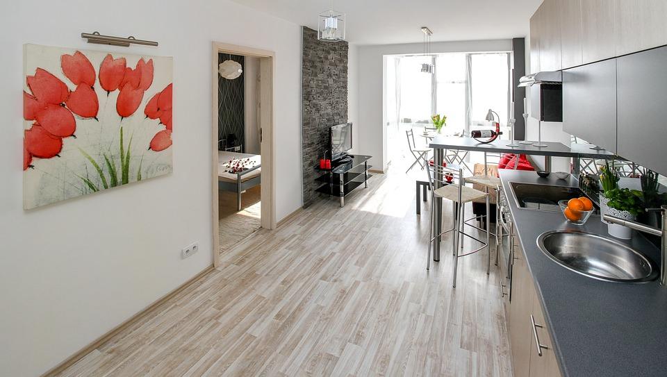
- Yellow – Fresh, fresh, fresh and suitable for any room in the house but particularly the kitchen and bathroom.
- Blue – Blue is generally known for providing a calming and sedating effect which makes it a perfect choice for the bedroom. Again, too dark a shade of blue can make the room look a bit gloomy.
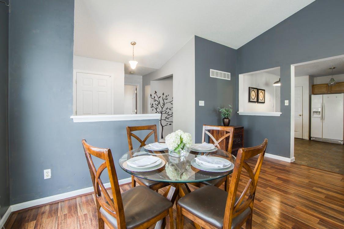
- Red – Red is the colour with the most dramatic appearance and should be utilised thoughtfully. Your painter will be able to give you some advice on the most suitable shades.
- Purple – Not quite as dramatic as red but, as a close relative, should be used carefully. Suitable for a more flamboyant family or individual.
- Orange – Another flamboyant colour that is probably best suited to the kitchen or dining areas. Generally speaking, a very happy colour.
- Black – A very powerful colour that should be used sparingly in conjunction with another colour. If used properly, black can lend an air of elegance and sophistication but too much can lead to an area that feels and looks depressing.
As previously mentioned, the colour or colours you choose for the interior design of your home is entirely subjective. It should also be noted that all the colours detailed above are available in an absolute plethora of shades that can be created by a professional painter to achieve the desired colour. Although you can of course paint your own interior, it’s worth bearing in mind that you will be living in it, so it probably makes sense to use the services of a professional painting company.